Employee Engagement Survey Dashboard
Turning 14,000 survey responses into a decision tool leadership actually opens.
Employee Engagement Survey Dashboard for the Pierce County, Washington dataset, using Power BI to convert more than 14,000 survey responses — sourced from the Maven Analytics Data Playground — into a structured, interactive, and decision-oriented reporting tool.
Data preparation
A single Excel table with roughly 15,000 rows required thorough cleaning before it could support a semantic model:
- Removal of duplicate rows
- Handling of missing assessments
- Elimination of duplicated questions
- Adding an Other Role category for missing role data, which covered about 72% of records
- Creating the relevant DAX measures for calculation
That last point is what made the rest possible. Response rate, satisfaction percentage, and the average agreement score per statement are all measures rather than pre-aggregated columns, so every visual re-computes correctly under any combination of role and department slicers.
Key features
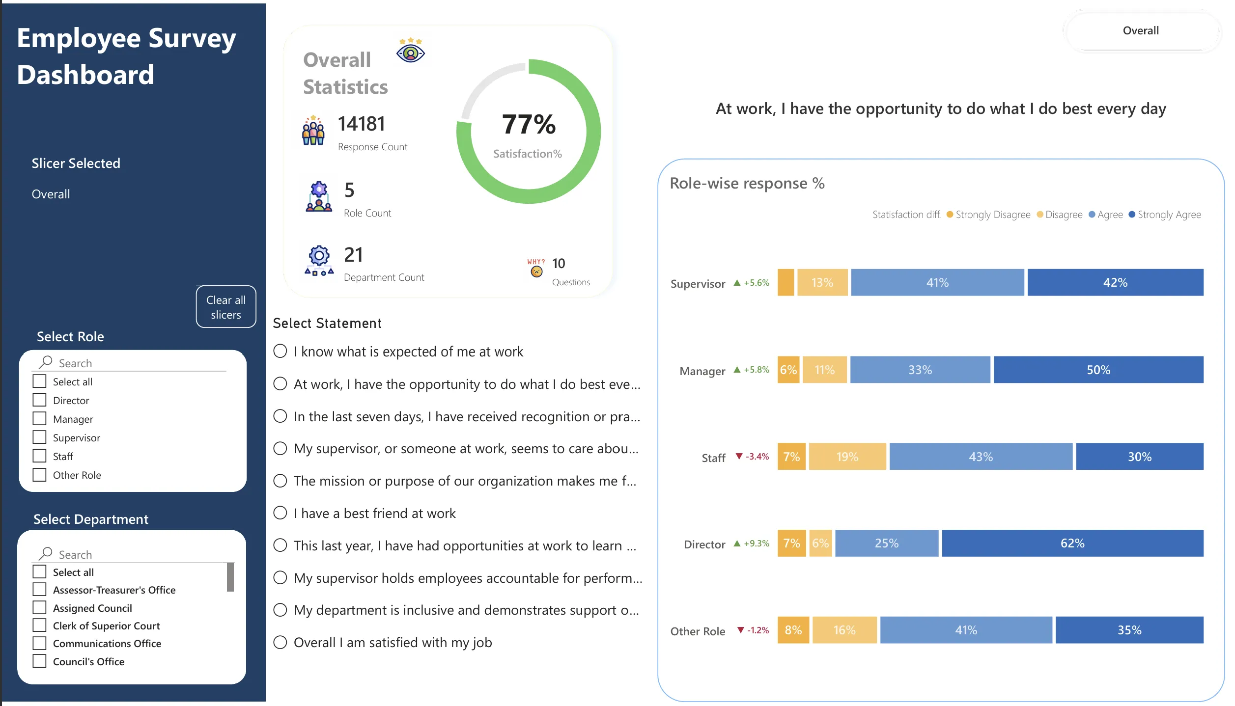
- Department- and role-level analysis enabled through dynamic slicers.
- Bookmarks and action buttons for intuitive, seamless navigation between analytical views.
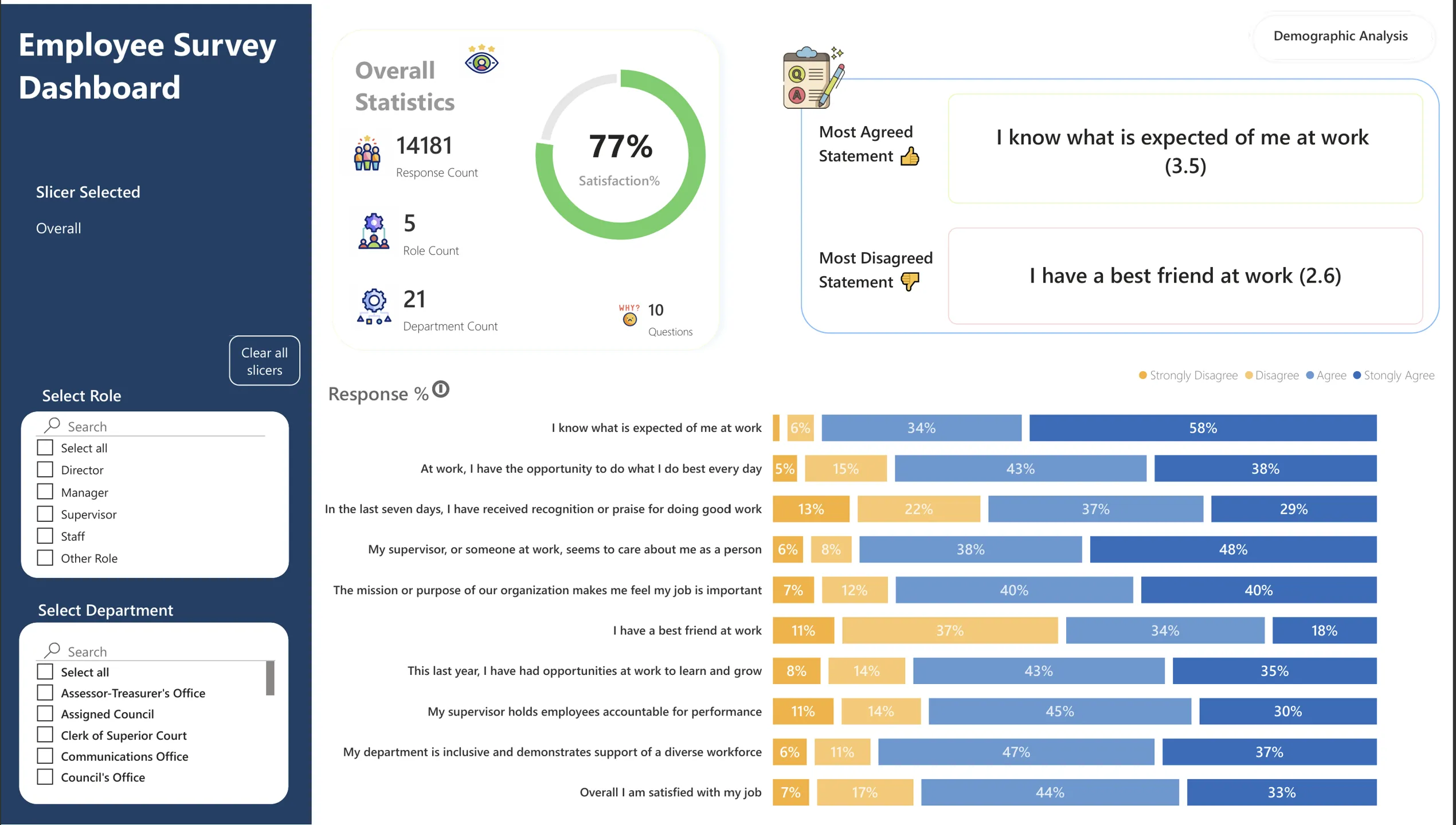
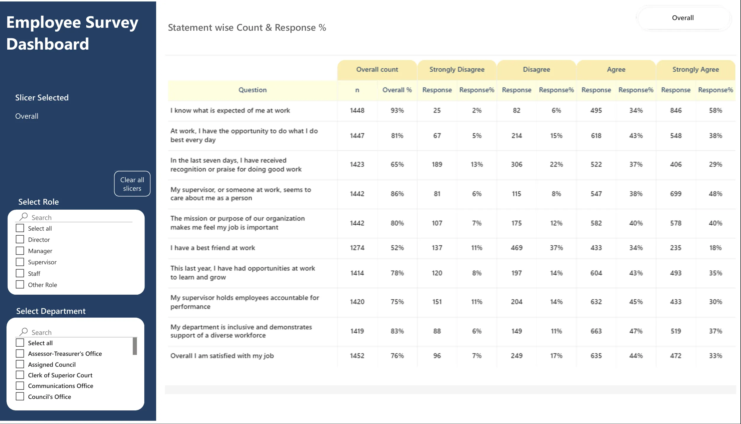
- Clear comparative visuals showing response distributions from Strongly Disagree through Strongly Agree.
What the data said
- Most agreed statement: “I know what is expected of me at work” — average score 3.5 / 4.
- Least agreed statement: “I have a best friend at work” — average score 2.6 / 4.
- Managers and Supervisors reported higher levels of agreement regarding recognition and growth opportunities.
- Staff feedback highlighted opportunities to strengthen workplace relationships and enhance learning and development initiatives.
Recommended strategic actions
Strengthen workplace relationships. Foster connections through team-building, cross-functional projects, and peer recognition.
Expand learning and development. Offer role-based training, continuous learning, and career-linked programmes.
Enhance leadership capability. Provide training on clarity, inclusivity, and coaching for consistent management.
Address department gaps. Deliver targeted interventions based on diagnostics and progress tracking.
Why this approach matters
Survey results have limited impact unless they are transformed into actionable insights. Presenting data in an interactive, visually intuitive, and role-specific manner empowers leadership teams to quickly identify trends, address gaps, and take evidence-based actions that drive measurable improvements in employee engagement.