Smart Pricing Pilot
A Databricks medallion pipeline that turns noisy smart-meter telemetry into audit-ready bills, without a raw email address ever reaching analytics.
GreenGrid Solutions is a smart energy startup piloting a Time-of-Use pricing model across 100 residential properties, ahead of a Series B round that depends on the pilot proving itself. Its billing ran on manual CSV exports and spreadsheet formulas, which could not cope with faulty sensor readings or keep customer emails out of the numbers they were joined against. The brief was a Databricks pipeline that validates every reading, protects the customer data it touches, applies the peak-hour rate correctly, and produces a daily billing table the pilot can be judged on.
The problem
100 meters (M-101 to M-200) on a Time-of-Use plan, charged a doubled rate for usage between 18:00 and 21:00. The telemetry feeding that plan was not clean: the December data carried 62 anomalous readings, negative values from sensor interference and phantom spikes registering thousands of kilowatts in a single window. Excel could not filter either kind out, so some of them were reaching customer bills. Separately, the failure rate in the Time-of-Use calculations itself sat at 15%, undercharging during the exact peak windows that make the pricing model worth running, an estimated $12K a month in leakage per 100 homes.
The other half of the problem was who could see what. Customer email addresses lived in plain text on a shared drive, joined directly to usage data, with copies spread across analyst desktops. GreenGrid’s head of product summed up why that mattered more than a typical bug: “If we send one wrong bill during this pilot, customer trust is gone forever. I cannot bill someone five thousand dollars for a toaster glitch.” A pilot that exists to prove a pricing model to investors does not get a second chance at its first bill.
The architecture
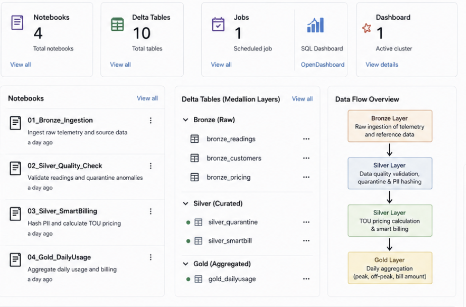
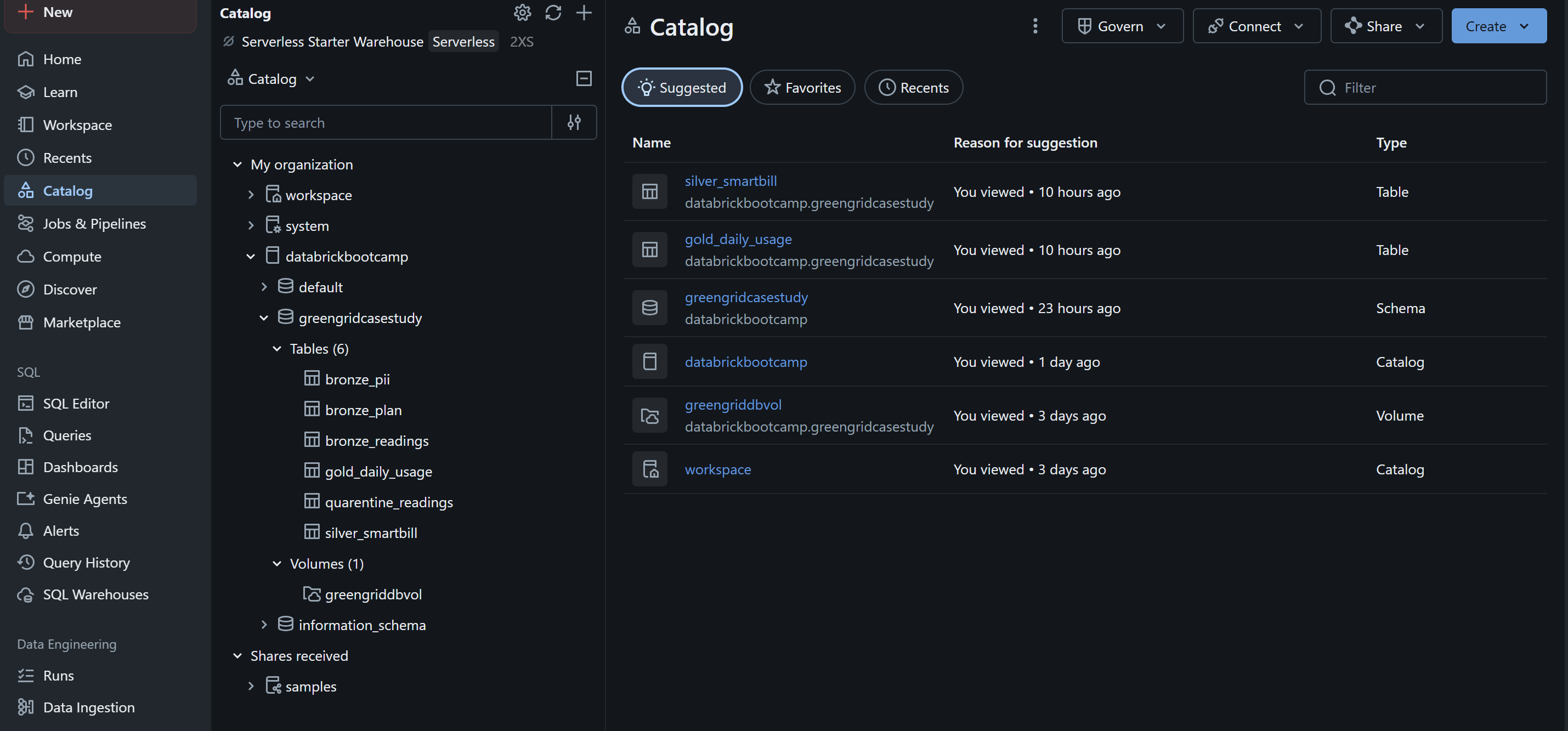
The approach was a three-layer Lakehouse: Bronze captures the raw telemetry, PII, and pricing plans exactly as they arrive; Silver is where quality and privacy get enforced, before any billing number is calculated; Gold aggregates the clean, billable results into a table a dashboard can sit on. The sequence matters as much as the logic inside each layer: ingest, then quarantine, then transform and hash, then aggregate. Running billing before quarantine, or writing a join before the email column is hashed, reintroduces the exact problem the pipeline exists to close.
 View full size (opens in a new tab)
 View full size (opens in a new tab)
Bronze: ingest everything, as it arrived
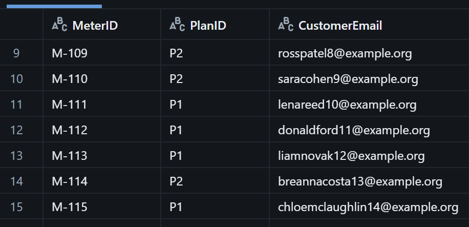
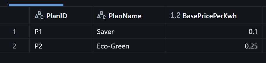
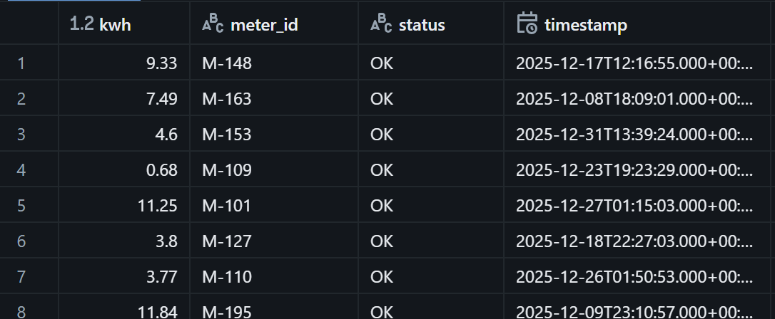
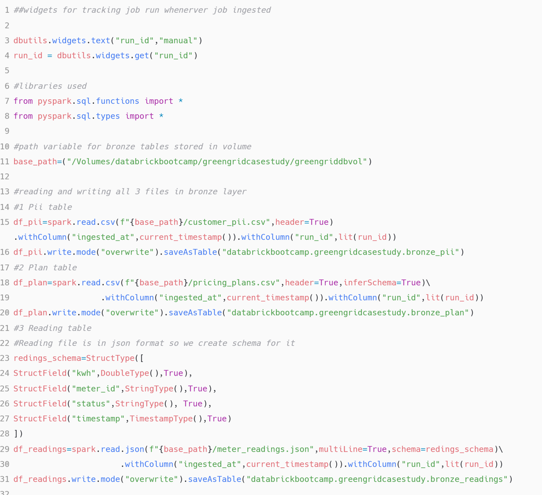
The Bronze layer’s only job is to land the three source datasets untouched. customer_pii.csv
carries the meter-to-email mapping, pricing_plans.csv carries the base rate per plan, and
meter_readings.json carries the telemetry itself, with an explicit StructType schema
because the readings arrive as JSON rather than a flat file.
 View full size (opens in a new tab)
 View full size (opens in a new tab)
 View full size (opens in a new tab)
 View full size (opens in a new tab)
Nothing here is filtered or transformed. Bronze exists so that if a later layer’s logic turns out to be wrong, the original data is still sitting there to reprocess against, rather than having been overwritten by the first attempt at cleaning it.
Silver, part one: quarantine before anyone bills
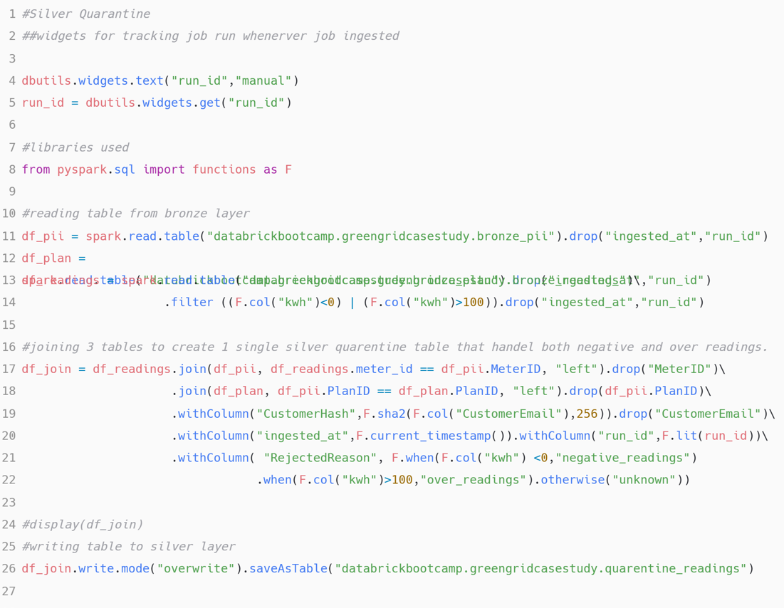
The acceptance criteria were explicit about the range a reading has to fall in: above zero, below one hundred kilowatt-hours. Anything outside it, negative from interference or a phantom spike from a faulty sensor, gets routed to a quarantine table with a reason attached, rather than either failing the job or being silently averaged away.
 View full size (opens in a new tab)
 View full size (opens in a new tab)
Routing invalid readings here, before the billing notebook runs, is what keeps a sensor glitch from ever becoming a line item on someone’s bill.
Silver, part two: apply the peak rate
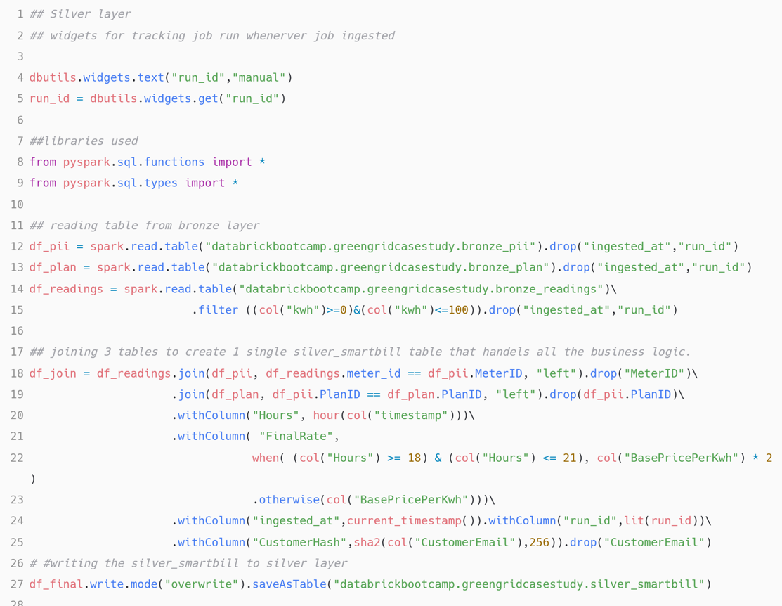
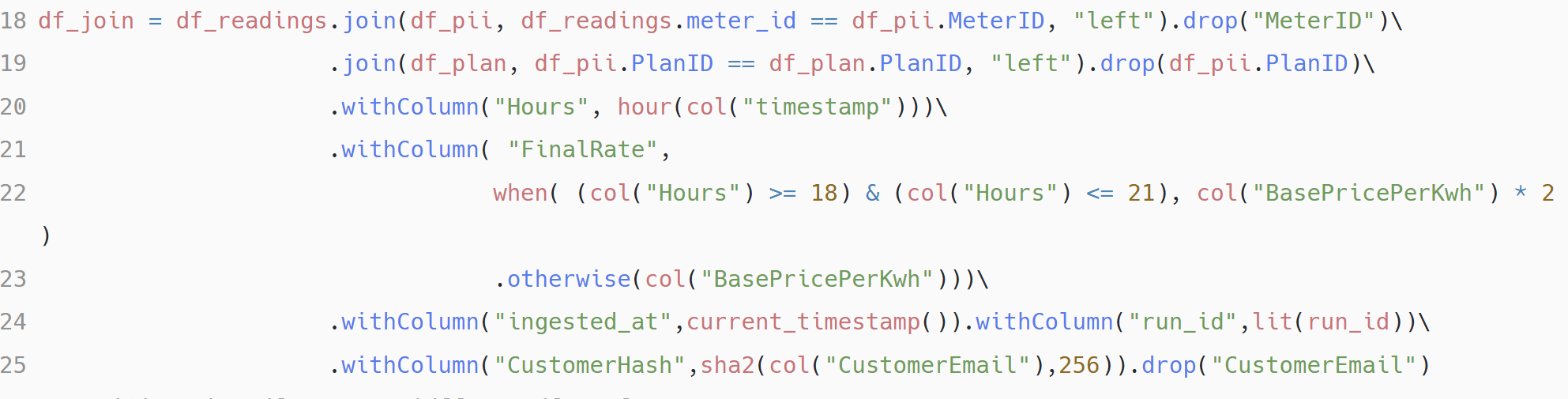
Readings that pass the range check move into the billing transformation. It joins the clean
readings against the plan and customer tables, derives an Hours column from the reading’s
timestamp, and doubles the base rate whenever that hour falls between 18:00 and 21:00.
 View full size (opens in a new tab)
 View full size (opens in a new tab)
Silver, part three: hash the identifier, don’t delete it
Customer email addresses could not reach the analytical tables, but Bill_Amount still has to
trace back to the right customer for support queries and audits later. Deleting the email
column outright would have broken that traceability; leaving it in plain text was the exact
liability the pilot was built to close.
Keep the join working without keeping the email
Silver_SmartBill has to join readings to the right customer, and Gold has to be able to trace a billing dispute back to a specific meter's history. But no email address is allowed to persist past Bronze, and unhashed PII in production halts the pilot outright. Delete the column and the join breaks; keep it and the pilot fails governance.
Each CustomerEmail value is hashed with SHA-256 (sha2(col("CustomerEmail"), 256)) into a
new CustomerHash column in the same transformation that builds the join, and the raw email
column is dropped before anything is written. Two rows for the same customer produce the same
hash, so a join on CustomerHash still finds the right person consistently, joins and
groupings keep working exactly as before, without the pipeline ever storing or transmitting
the address itself.
It’s worth being precise about what this does and doesn’t guarantee: the hash isn’t salted, so if the hash values themselves ever leaked, an attacker with a list of likely email addresses could still match them by re-hashing and comparing. A salted hash is the next hardening step, not something this pilot needed in order to ship, since the goal here was keeping the raw address out of every downstream table, not defending the hash values themselves.
 View full size (opens in a new tab)
 View full size (opens in a new tab)
Gold: aggregate for reporting
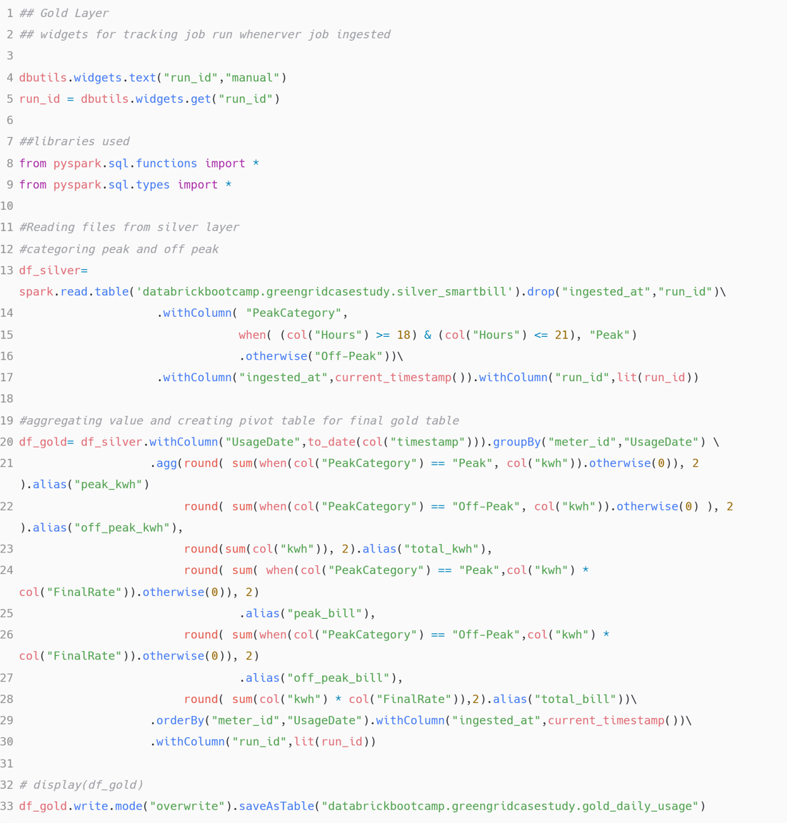
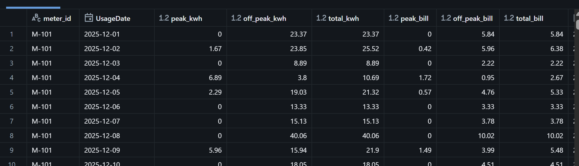
The final notebook reads silver_smartbill, labels each reading Peak or Off-Peak from its
hour, and groups by meter and usage date to produce one row per meter per day: peak
consumption, off-peak consumption, total usage, and the billed amount for each.
 View full size (opens in a new tab)
 View full size (opens in a new tab)
Orchestration: one job, four tasks
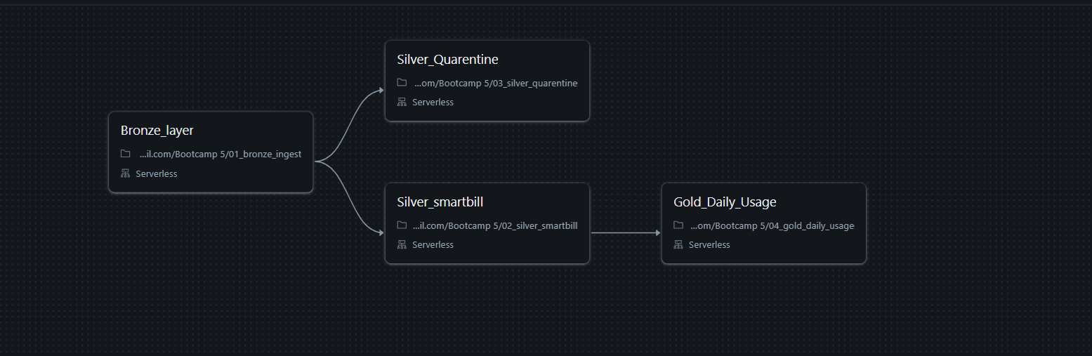
The four notebooks become four tasks in a single Databricks Job. Bronze runs first; the
quarantine notebook and the SmartBill notebook both depend on it and can run in parallel;
Gold depends on SmartBill finishing. processing_date and run_id are set once at the job
level and passed into every task’s widgets, so a daily schedule needs no manual input, and
each task writes its own table with replaceWhere on the processing date, so re-running or
backfilling a single day never touches any other day’s rows.
 View full size (opens in a new tab)
The dashboard
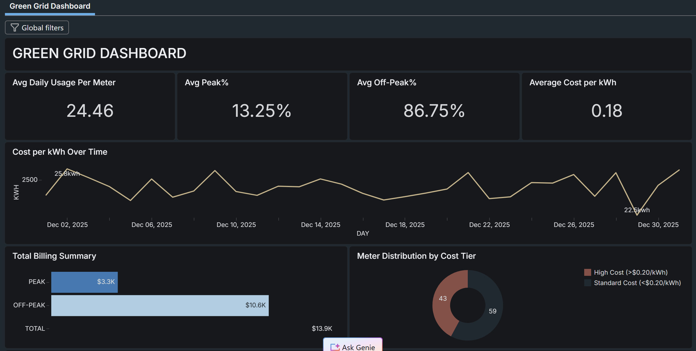
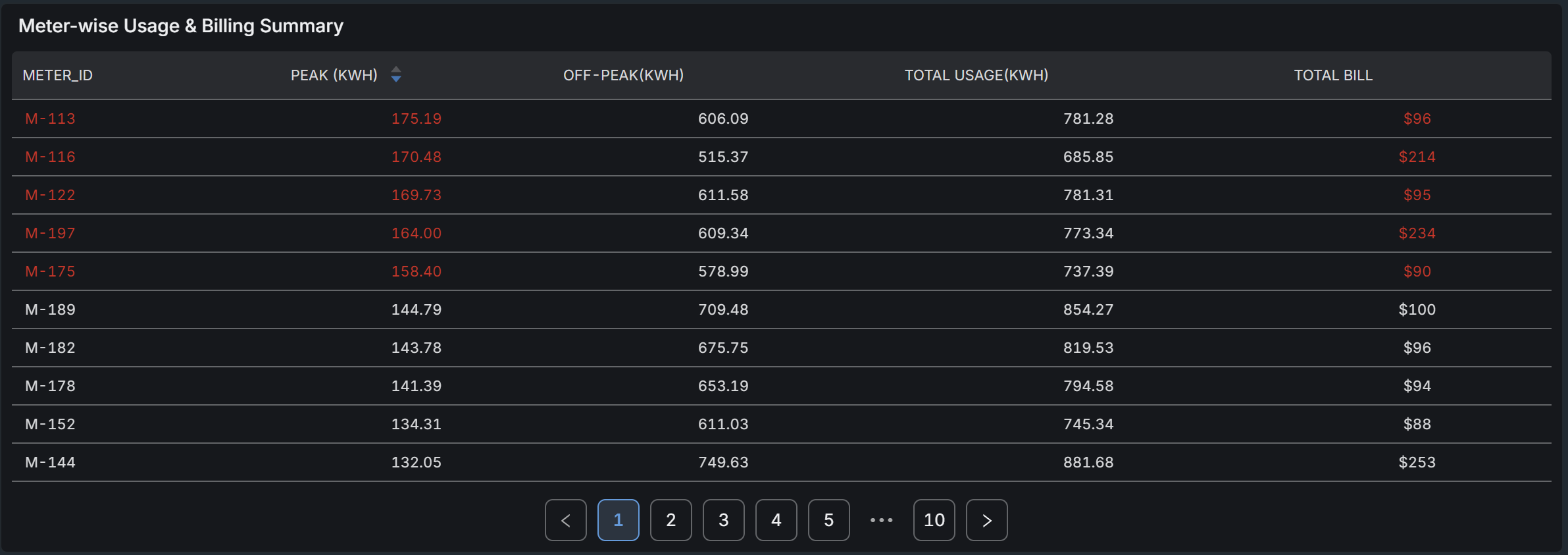
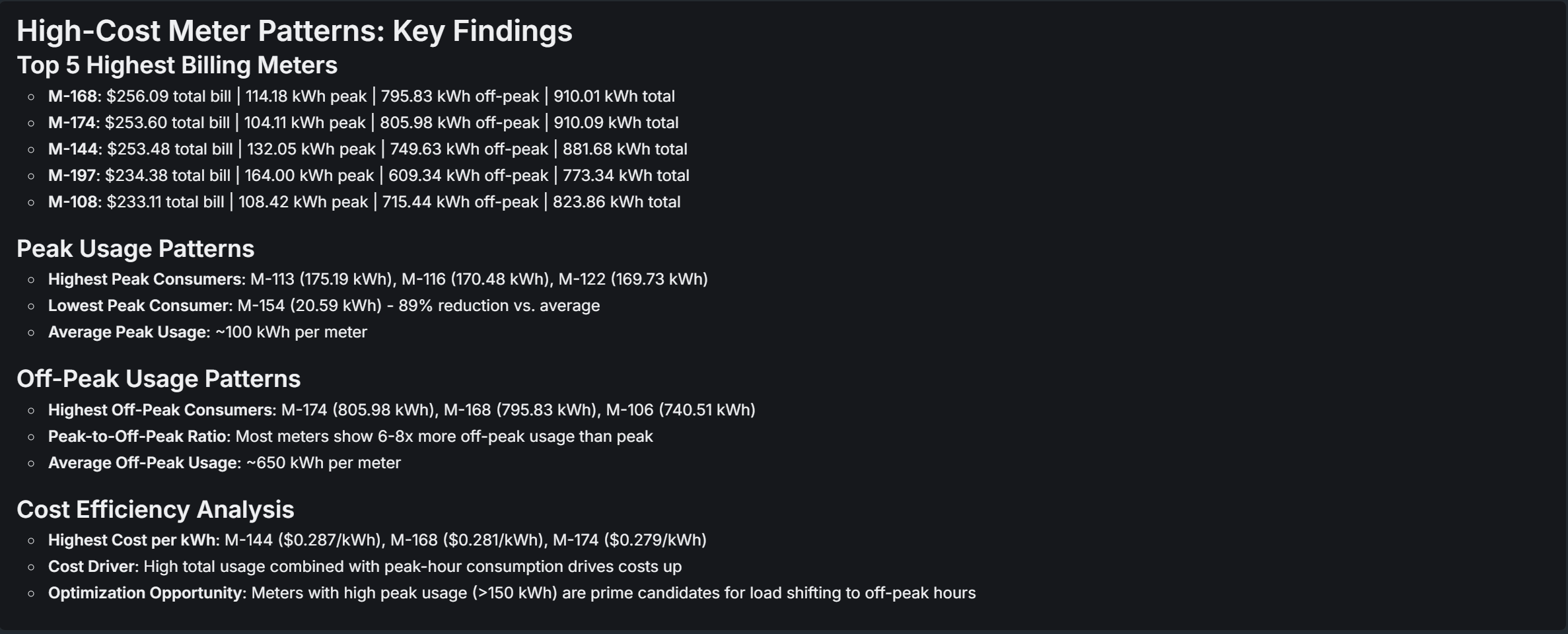
With Gold in place, a Databricks SQL Dashboard sits directly on gold_daily_usage: average
daily usage per meter, the peak and off-peak share of consumption, average cost per kilowatt-hour,
and a running chart of cost over the month.
 View full size (opens in a new tab)
 View full size (opens in a new tab)
 View full size (opens in a new tab)
What this proves
A medallion pipeline can enforce data quality and privacy before a single billing number is calculated, rather than cleaning up after the fact. Quarantining bad readings ahead of the billing join keeps a sensor fault from ever reaching an invoice, and hashing the customer identifier in the same step that builds the join keeps referential integrity intact without ever writing a plain-text email to a table a report can query. Both protections had to live in the pipeline’s structure, not in a downstream check, because by the time a downstream check runs, the bad bill has already been calculated.